7 WooCommerce Product Page Mistakes That Could Be Costing You Sales
Your WooCommerce product page could be losing potential customers without you realizing it. From poor product imagery and slow loading times to missing interactive experiences, discover seven common mistakes and practical ways to create better shopping experiences that help customers buy with confidence.
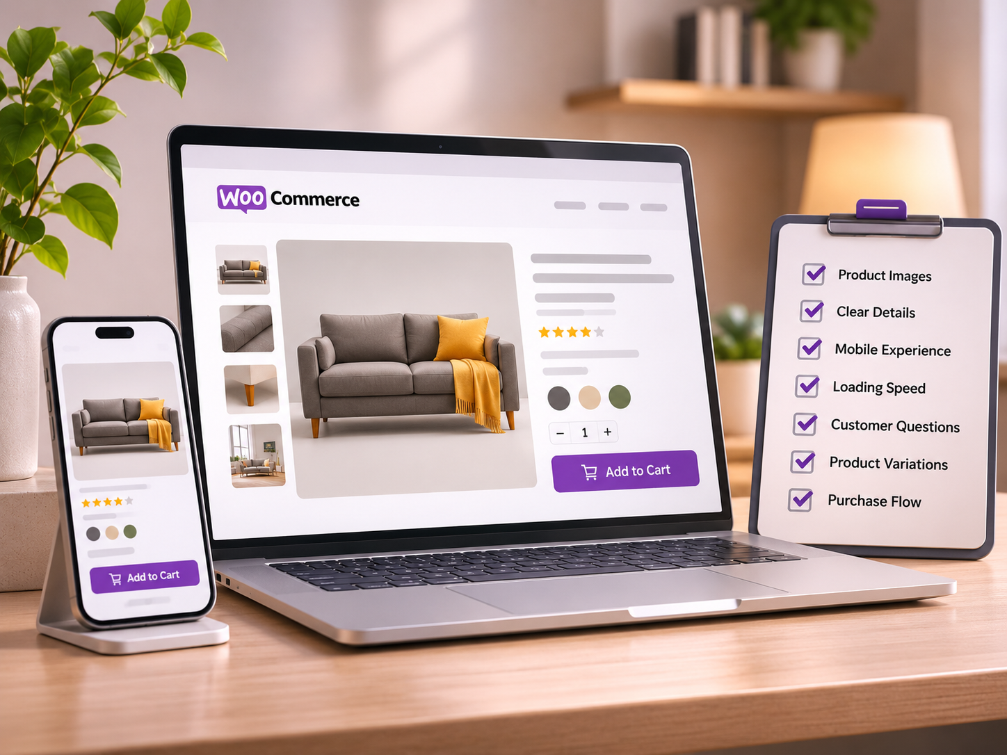
Getting visitors to your WooCommerce store is only half the challenge. What happens after someone lands on a product page can determine whether they continue shopping, add an item to their cart, or leave without taking action. A product page should do more than display a photograph, price, and purchase button. It should help customers understand what they are buying, how the product works, and whether it meets their needs.
Yet many WooCommerce stores overlook small details that make the buying experience unnecessarily difficult.
Here are seven common product page mistakes worth addressing, along with practical ways to improve them.
1. Relying on a Single Product Image
A single photograph rarely tells the complete story of a product.
Imagine shopping for a decorative wall light. The product image shows its design, but how does it look when illuminated? Is the light warm or cool? How does it change the appearance of the surrounding space?
These questions matter, especially when customers cannot physically examine the product.
The same applies to furniture, appliances, electronics, and products with multiple operating states.
How to improve it
Include several high-quality images showing different angles.
Show the product in realistic environments.
Highlight important features and physical details.
Use before-and-after or on-and-off views when the product has distinct visual states.
Keep backgrounds, proportions, and image quality consistent.
WooCommerce supports featured images and product galleries, making it possible to showcase multiple perspectives without changing your entire storefront.
For products with visually distinct states, an interactive comparison can help customers understand the difference without searching through several photographs.
2. Describing Features Instead of Demonstrating Them
Product descriptions are important, but words cannot always communicate how something works.
Consider the difference between these statements:
"This lamp features adjustable illumination."
And:
A customer switches between two images to see the lamp illuminated and unilluminated.
Both communicate a feature, but the second provides immediate visual context.
This is particularly relevant for products where appearance changes during operation.
How to improve it
Use descriptions to explain specifications, materials, and benefits. Complement them with visual demonstrations where appropriate.
For example:
Lighting products: Illuminated versus unilluminated
Appliances: Open versus closed
Electronic devices: Screen active versus inactive
Convertible furniture: Folded versus expanded
Decorative products: Different functional configurations
Not every product needs a complex animation or video.
Sometimes, switching between two carefully prepared images is enough to communicate an important feature.
Where interactive product states fit in
This is the type of experience that StateSwitch - Product Switcher for WooCommerce is designed to support.
Rather than requiring shoppers to interpret two separate images, StateSwitch lets merchants present distinct product states through a simple interactive switching experience.
It offers a focused way to demonstrate visual changes while keeping the product page familiar and straightforward.
3. Overloading the Product Page With Information
More information does not automatically create a better shopping experience.
Some product pages are filled with promotional banners, competing calls to action, oversized widgets, lengthy descriptions, and multiple pop-ups.
The result can be a page where the most important information becomes difficult to find.
Customers should not need to search for the product price, available options, delivery details, or purchase button.
How to improve it
Organize your product page around a clear hierarchy:
Product name and primary image
Price and essential product information
Available options and purchase controls
Key benefits and functional details
Delivery, returns, and other purchasing information
Additional specifications and supporting content
Use expandable sections or tabs for detailed information when they genuinely improve readability.
Interactive features should serve a purpose. A product demonstration that explains a useful feature is more valuable than an animation added only for visual effect.
The objective is not to make the page look busy. It is to make the buying decision easier.
4. Ignoring the Mobile Shopping Experience
A product page that looks excellent on a desktop monitor can become frustrating on a smartphone.
Images may take up too much vertical space. Buttons may be difficult to reach. Product options can become cramped, and interactive elements may not respond comfortably to touch.
For customers browsing on mobile devices, these issues introduce friction at important moments.
How to improve it
Review your product pages on actual mobile devices, not only through desktop browser previews.
Pay particular attention to:
Product images that fit the screen without awkward cropping
Buttons and controls that are comfortably tappable
Readable descriptions and specifications
Clearly visible prices and purchasing options
Interactive elements that work with touch input
Layouts that avoid unnecessary horizontal scrolling
Test different screen sizes and both portrait and landscape orientations when relevant.
When adding plugins or interactive product features, check that they behave consistently across desktop and mobile experiences.
A useful feature should remain useful regardless of the device a customer chooses.
5. Using Large, Slow-Loading Images
High-quality product photography is essential, but unnecessarily large image files can create performance problems.
Uploading oversized photographs without optimization may increase page weight and delay the appearance of important content.
Product galleries, decorative assets, third-party scripts, and poorly configured plugins can add to the problem.
A visually impressive product page loses some of its value if customers struggle to load it.
How to improve it
Start with a few practical improvements:
Resize images to dimensions appropriate for their display.
Use efficient formats such as WebP or AVIF where supported.
Compress images without noticeably reducing visual quality.
Serve responsive image sizes.
Avoid unnecessary scripts and oversized visual assets.
Test performance with tools such as PageSpeed Insights.
WooCommerce provides image handling capabilities, and modern WordPress setups can support responsive images and optimized delivery.
For interactive before-and-after displays, prepare both images at matching dimensions and optimize them individually.
Also review loading priority. Important above-the-fold product imagery should appear promptly, while content farther down the page can often load later.
The objective is to balance visual quality with a responsive browsing experience.
6. Leaving Important Customer Questions Unanswered
A product page might look polished and still leave customers uncertain.
How large is the item? What is included in the package? Is installation required? Can the product be returned? Does it support a particular device or fitting?
Unanswered questions can interrupt the purchase journey.
Customers may leave to research the product elsewhere, contact support, or postpone the decision entirely.
How to improve it
Think about the questions customers are likely to ask before buying.
Depending on the product category, make sure your page clearly communicates:
Dimensions, materials, and technical specifications
Compatibility and installation requirements
Available configurations or options
Delivery estimates and shipping conditions
Return and warranty information
What is included in the purchase
Use genuine customer reviews and frequently asked questions where appropriate.
For products with functional differences, visual demonstrations can answer questions that text alone may not address.
A shopper considering a light fixture, for example, may want to see its illuminated appearance before reading its full technical specifications.
Providing both forms of information makes the product easier to evaluate.
7. Treating Every Product the Same
WooCommerce makes it possible to build consistent product templates, which is useful for store management and design.
However, consistency should not mean ignoring the differences between product categories.
A clothing product, a ceiling fan, a software license, and a convertible sofa do not require identical demonstrations.
For clothing, size guides and fabric details may be especially important.
For electronics, compatibility and technical specifications often take priority.
For lighting and furniture, appearance and functional states may significantly influence how customers evaluate the product.
How to improve it
Start by identifying what customers need to understand about each product.
Ask three questions:
What makes this product different?
What information is difficult to communicate through a standard photograph?
Would an additional image, demonstration, or interaction make that information clearer?
Choose presentation features based on the answers.
Some products benefit from galleries. Others need variation selectors, comparison tables, demonstration videos, or interactive state switching.
The most effective product experience is not necessarily the one with the most features. It is the one that communicates the right information clearly.
A Better Product Page Starts With Clarity
Improving a WooCommerce product page does not always require a redesign.
Often, meaningful improvements come from small changes: better product imagery, clearer specifications, faster loading, more thoughtful mobile layouts, and demonstrations that answer real customer questions.
Interactive product experiences can play a useful role, particularly when shoppers need to understand how a product looks or behaves in different states.
Tools like StateSwitch make this kind of interaction accessible to WooCommerce merchants without requiring a completely new product page experience.
The broader principle is simple:
Help customers understand the product before asking them to buy it.
When product pages communicate clearly, shoppers can evaluate items with greater confidence and make more informed purchasing decisions.
Frequently Asked Questions
What makes a good WooCommerce product page?
A good WooCommerce product page combines clear product images, accurate descriptions, accessible purchase controls, helpful specifications, and transparent purchasing information. It should also load efficiently and work well on mobile devices.
How can I improve WooCommerce product pages without redesigning my website?
Start by improving images, simplifying product descriptions, reviewing mobile usability, optimizing performance, and making important purchasing information easier to find. Add focused interactive features only when they help explain the product.
Are interactive product images useful for WooCommerce?
They can be useful when a product has visual states or configurations that customers need to compare. Lighting, electronics, appliances, and convertible furniture are examples where a simple interactive demonstration may help.
Do I need a custom WooCommerce theme for interactive product displays?
Not necessarily. Depending on the required functionality, a compatible WooCommerce plugin may provide interactive features without requiring a custom theme or complete storefront rebuild.
Can better product pages improve conversions?
Clearer product information and smoother usability can reduce friction in the shopping journey, but conversion outcomes depend on many factors, including pricing, traffic quality, product demand, and trust. Measure changes using store analytics and controlled experiments where possible.
From the Journal
Continue Exploring
WooCommerce Product Images: Best Practices for Better Shopping Experiences
Great product imagery does more than make an online store look attractive. It helps customers understand what they are buying. Discover 10 practical WooCommerce product image best practices, from choosing the right dimensions and formats to building effective galleries, improving loading performance, and creating interactive product previews.
Why Interactive Product Demonstrations Matter in eCommerce
Online shoppers cannot touch, test, or experience products before buying. Interactive product demonstrations help bridge that gap by showing how products look, work, and change in real-world situations. Discover why visual interaction matters in eCommerce and how WooCommerce stores can create more engaging product experiences without unnecessary complexity.
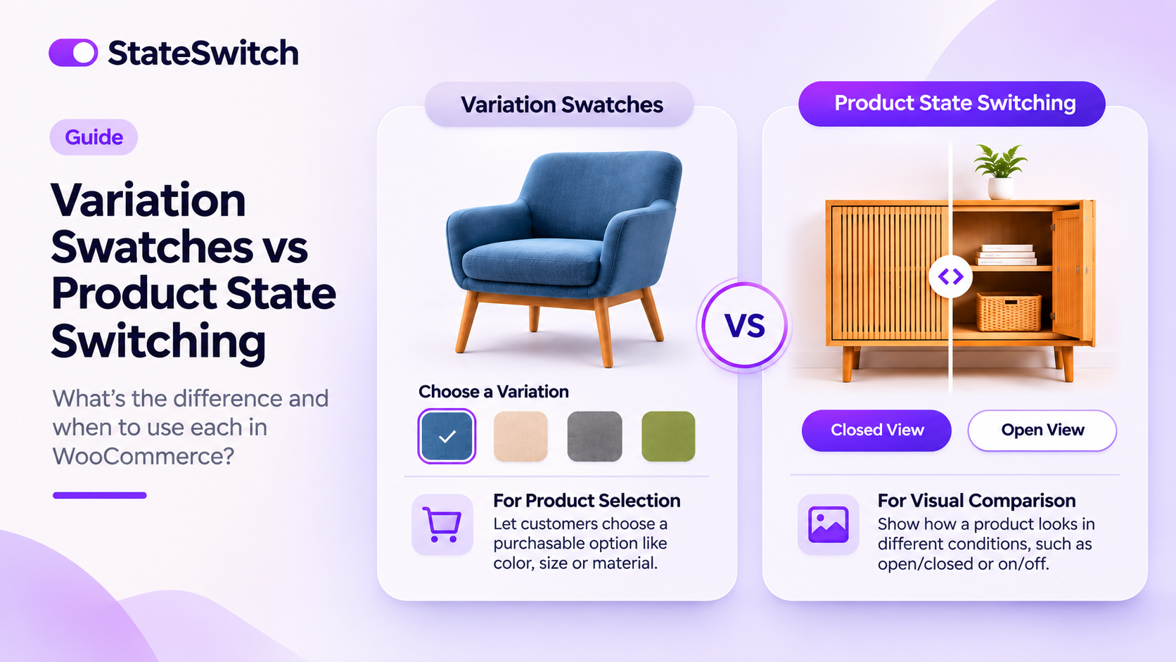
WooCommerce Variation Swatches vs Product State Switching: What's the Difference?
WooCommerce variation swatches and product state switching may look similar, but they serve different purposes. Discover how each works, when to use them, and how to create a more interactive shopping experience with the right product presentation tools.